Self portrait
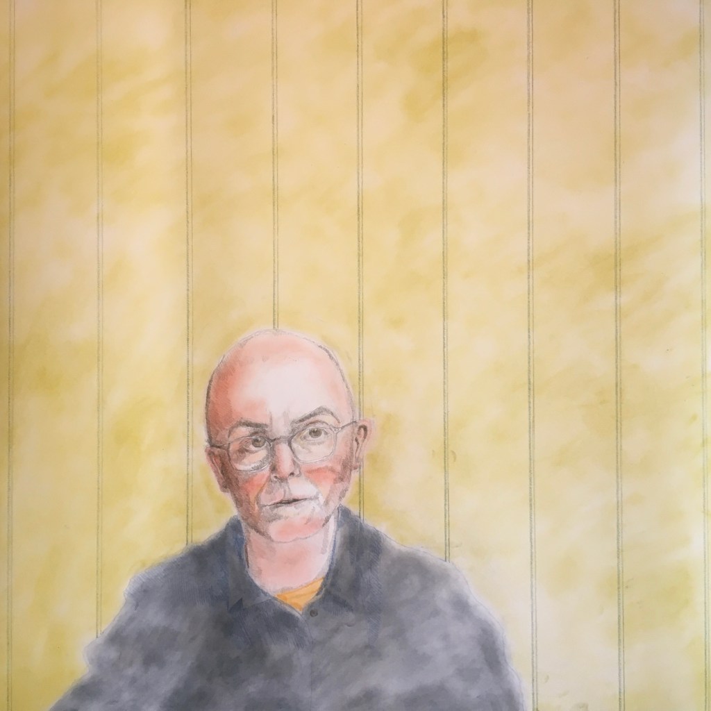
I think these are getting better. The technique using the chalk pastel for tonal background instead of ink washes makes a softer and richer coloured image. There’s also more detail.
I think these are getting better. The technique using the chalk pastel for tonal background instead of ink washes makes a softer and richer coloured image. There’s also more detail.

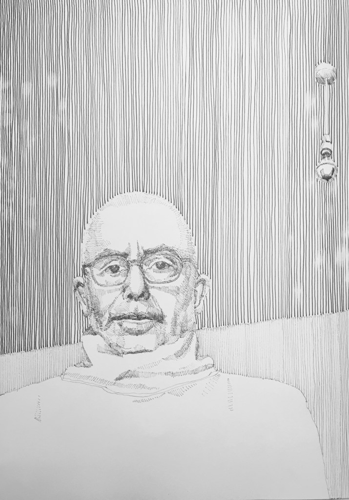
This is another big drawing where the ink washes have not worked as smoothly as I’d hoped. They are impossible to get even on this kind of paper. I’d hoped that with the additional pencil work layered on top they’d disappear or become less visible. In reality they do not look as strong as in the photograph but are still too dominant against the coloured pencil.
I am going to experiment further with some different watercolour papers – Arches Aquarelle, Saunders Waterford and Fabriano Artistico – all hot pressed and at 300gsm weights. Hopefully one of these will work better. So far the best paper I’ve found for this technique is wall lining paper from Wickes but the rolls are not wide enough and I worry about their long term stability.


Experimenting with ink pen, soft pastel and coloured pencil on 42 x 29cm paper.

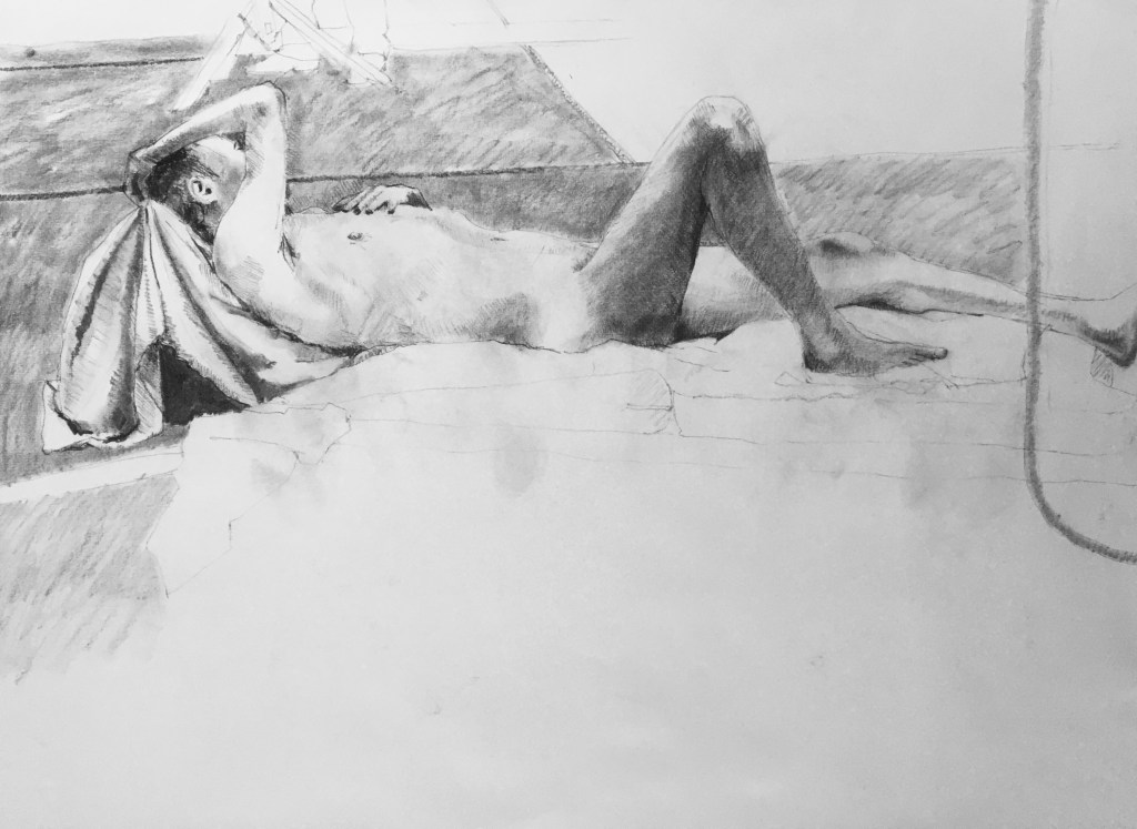

Actually a quick drawing but badly photographed as the paper kept ‘dishing’ and hence the curved non-parallel lines of window and table.

Fantastic model who I have drawn many times before at the Royal Drawing School’s Saturday life drawing class. Excellent session.

